
Check-In Activity Chart
 A picture is worth a thousand words, so a chart is probably worth quite a few as well. This chart (really a line graph) shows how many people checked-in (using TouchPoint Check-In) during 20-minute segments on a Sunday morning. You might be surprised at how many people are checking in during a very short period of time.
Take a look at this chart. You can see very clearly when our check-in kiosks are the busiest.
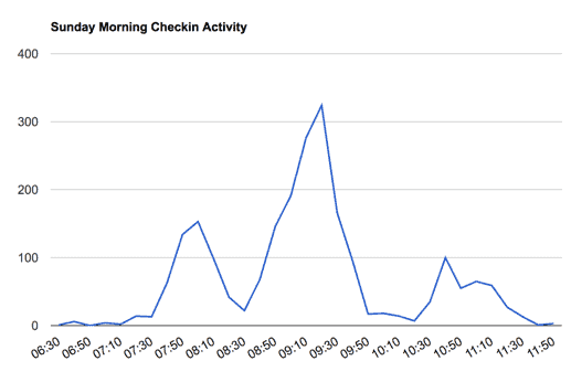
Why would you want to see this? One reason is to know when you will need to most volunteers. Also, this clearly shows you what time of the morning you should probably observe what's going on, in order to determine if things are going smoothly. You might find that you need another check-in station.
How can you add this to your database? It's very simple. Take a look at the help article and follow the instructions. We have all the code right there for you to copy and paste into a Python Script in your database.
Read more...